How to read your displacement with the charts in TotaLite Platform
Once the baseline is set, displacement data is available for analysis. Navigate to the Project Page and scroll down to the Measurements section to access the interactive charts.
Available Charts
Displacement
- Displacement (vertical)
- Displacement (horizontal)
Inter-Target Distance
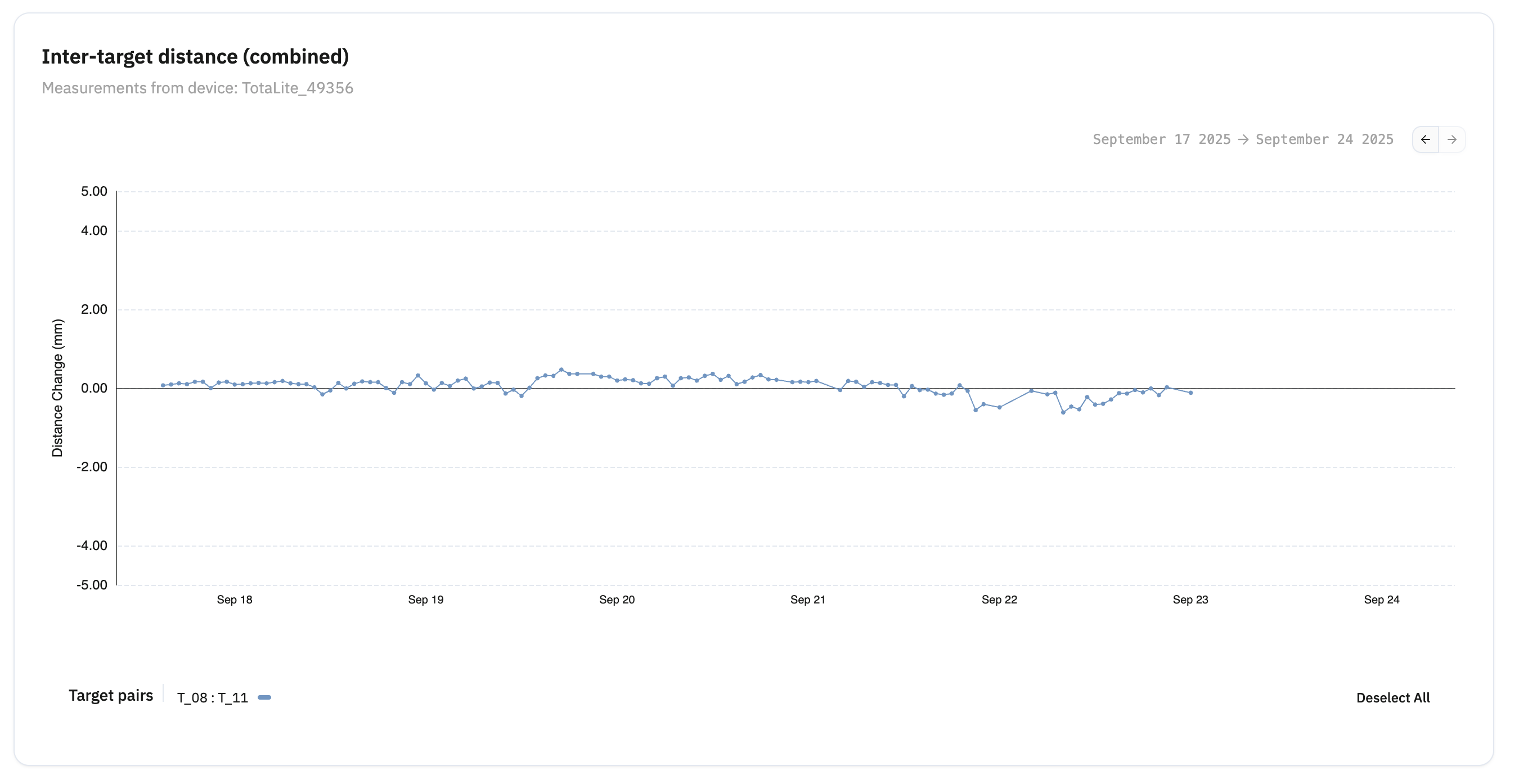
- Inter-target distance (combined)
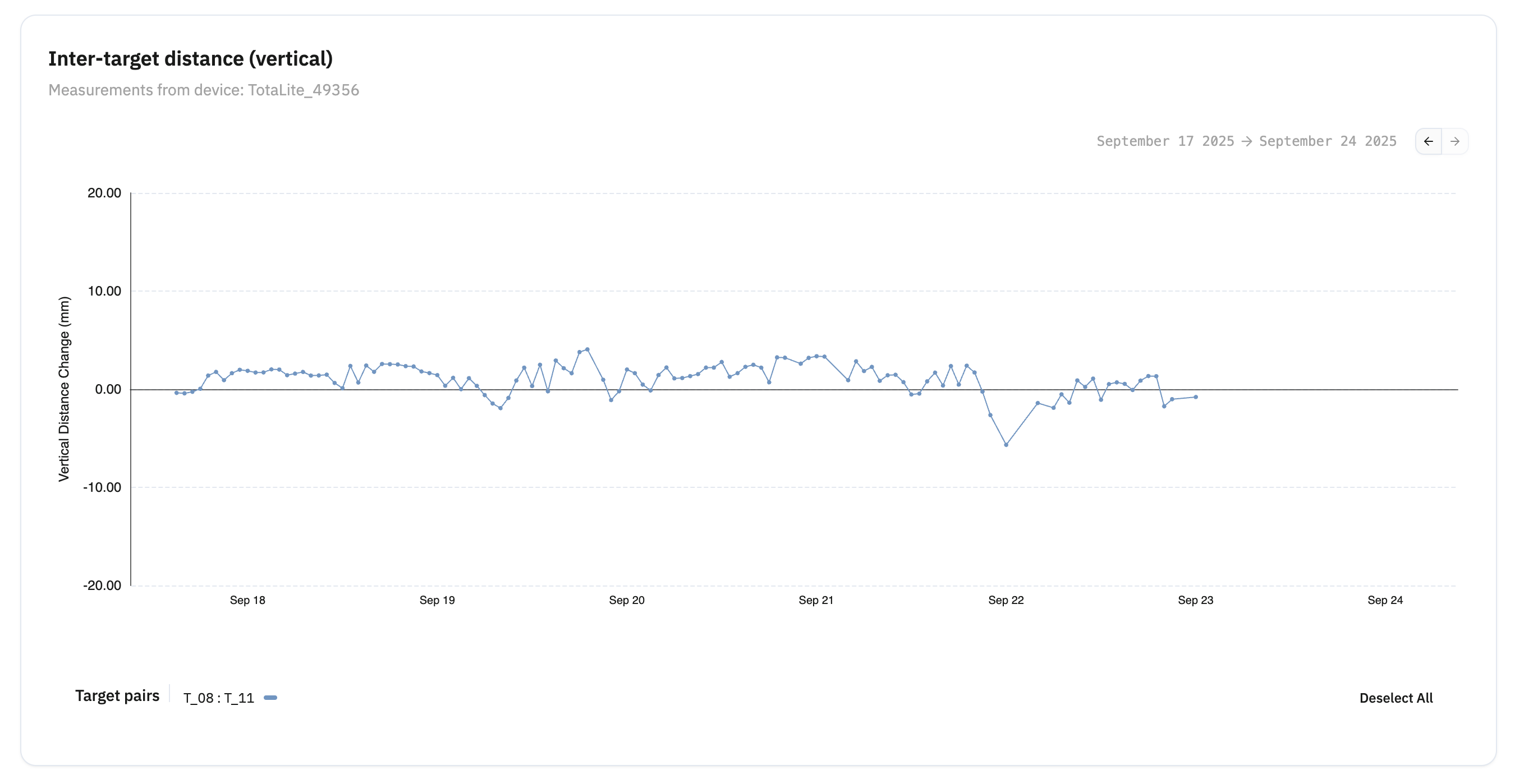
- Inter-target distance (vertical)
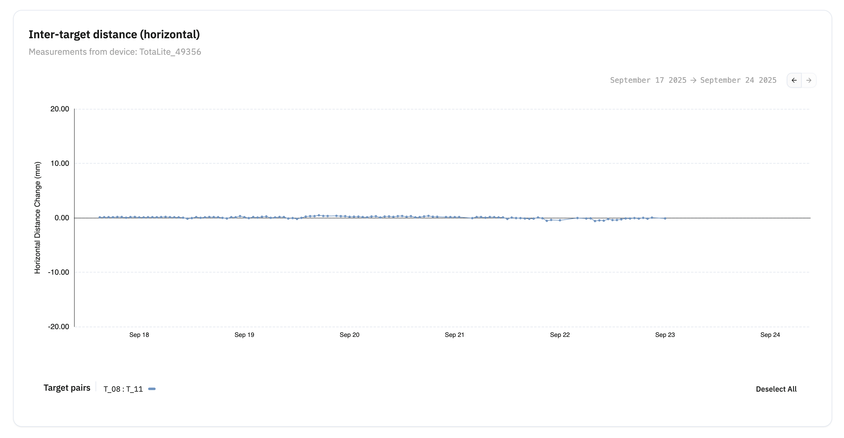
- Inter-target distance (horizontal)
Target displacement charts show horizontal and vertical movement of individual targets relative to their measurement planes. Inter-target distance charts show relative movement between paired targets — useful for monitoring convergence, divergence, or differential settlement.
Chart Customisation
Each chart lets you:
- Toggle individual targets on or off for focused analysis
- Display all targets simultaneously for a full overview
- Compare specific target subsets to identify movement patterns
- Set up alerts for individual targets
Scroll through the page to access all charts.
Vertical displacement chart
Horizontal displacement chart
Inter-target combined chart
Inter-target vertical
Inter-target horizontal
Time Range Selection
For each chart, a time range can be selected.
You can choose between available presets or select a desired range with the calendar. The presets are:
- 24 hours
- 3 days
- 1 week
- 1 month
- 3 months
- 6 monts
Data Feed Selection
Select the sensor and time range for each chart. Data can be visualised in two modes:
- Raw Data - all available data points
- Normal (Median, recommended) - 6h median, reducing noise for cleaner visualisation
Use Raw Data for detailed inspection. Switch to Median Data for a cleaner read on projects with frequent measurement intervals (under 1 hour). The difference in clarity between the two is visible in the chart examples below.
Raw Data
Normal (Median, recommended), a cleaner way to visualise the charts which is still characteristic data for a monitoring project with frequent (<1h) measurement points.